
Negative space design is a creative and breathtaking view on design and advertising.
- FedEx
Winning a ton of awards, this design is still rated as one of the best uses of negative space by incorporating an arrow in between the “d” of “Fed” and the “E” of “Ex.”

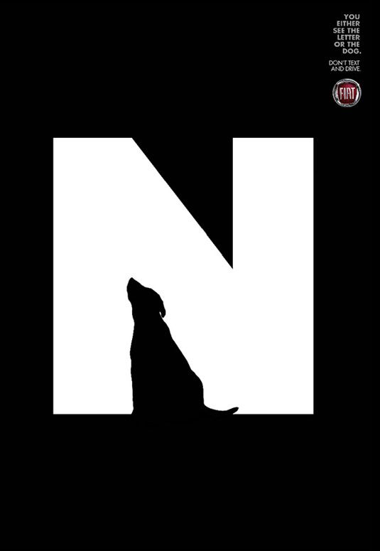
2. Fiat
A campaign of Fiat, worldwide ad agency Leo Burnett created a brilliant negative space advert to warn against texting while driving, it incorporates a letter (so your “text” you would be typing) with the shape of a beautiful silhouette of either a dog, girl or bus and continues to state that you only see one.
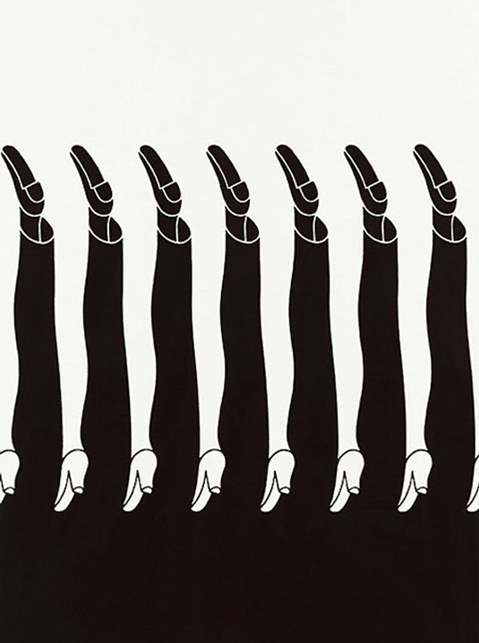
03. Shigeo Fukuda
Japanese poster designer and graphic artist brought him world renown for his optical illusions. Slightly disorientating, this is cleverly design using stark black and white contrasts is still a creative beauty.
04. Monster Bite Cookies
This design by Michael De Pippo features a hungry cookie monster as the cookie. This Canadian graphic designer made brilliant use of negative space design.

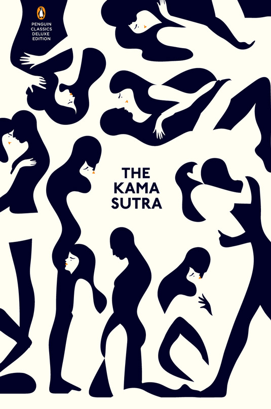
05. Karma Sutra
French artist and illustrator Malika Favre was commissioned to create this and her use of negative space design is breathtaking in how well it flows. Using graphic shapes and bold colours, many tries were done to make this creative and beautiful piece.
[via Creative Bloq, images via various sources]